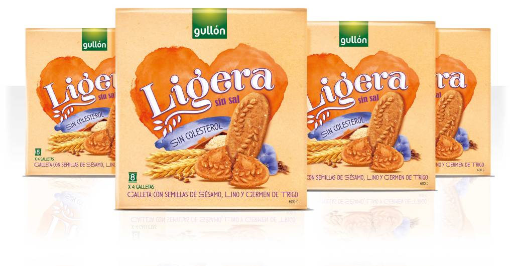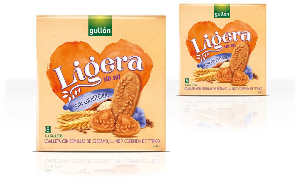
Gullón. Ligera
Packaging + sub branding
Gullón, a leading Spanish biscuit manufacturer, launched a new sub-brand named “Ligera”, targeting health-conscious consumers. “Ligera,” meaning “Light” in Spanish, reflects the product’s nutritional benefits: no added salt, no cholesterol, and a lighter texture.


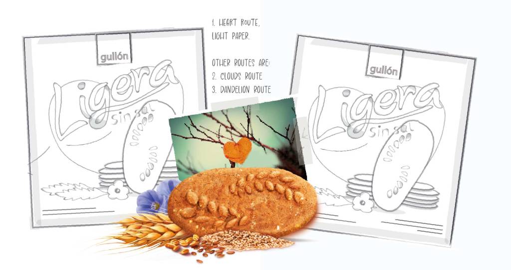
The objective was to create a visual identity that clearly communicates health, lightness, and a sense of wellbeing while standing apart from the core Gullón brand. To bring this concept to life, we developed several creative routes under the overarching theme of “Light.”
Heart Route (Watercolor / Aquarelle)
Introduces a warm, emotional layer to the concept of lightness. A softly painted watercolor heart symbolizes care, self-love, and wellbeing. This approach gently reinforces the idea that choosing Ligera is a small act of love for your body.
Other routes: Dandelion route uses the metaphor of a dandelion seed drifting through the air to represent delicacy, freedom, and natural wellness. The visual language is minimal and organic with soft color gradients, and natural textures. The Cloud route explores softness and serenity. Inspired by the airy, floating quality of clouds, this design uses colours related to nature, rounded shapes, and a sense of spaciousness to communicate comfort and lightness.
