Campofrío
Navidul
Packaging + branding
Navidul is a large Spanish company specialized in cured meats with products sold in more than 49 countries.
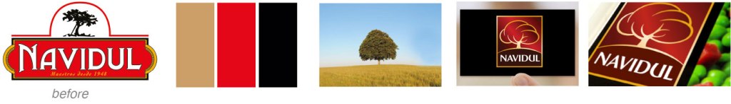
The goal was to help re-establish its position as the market leader in Spain and to reconnect the brand with consumers by refreshing its image on supermarket shelves through a more contemporary look. The updated logo preserves the brand’s heritage—founded in 1948—while retaining key elements like the iconic oak tree, now reimagined in vibrant colours to convey quality, energy, and trust.
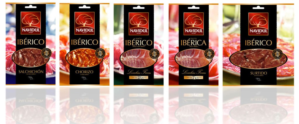
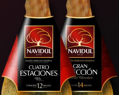


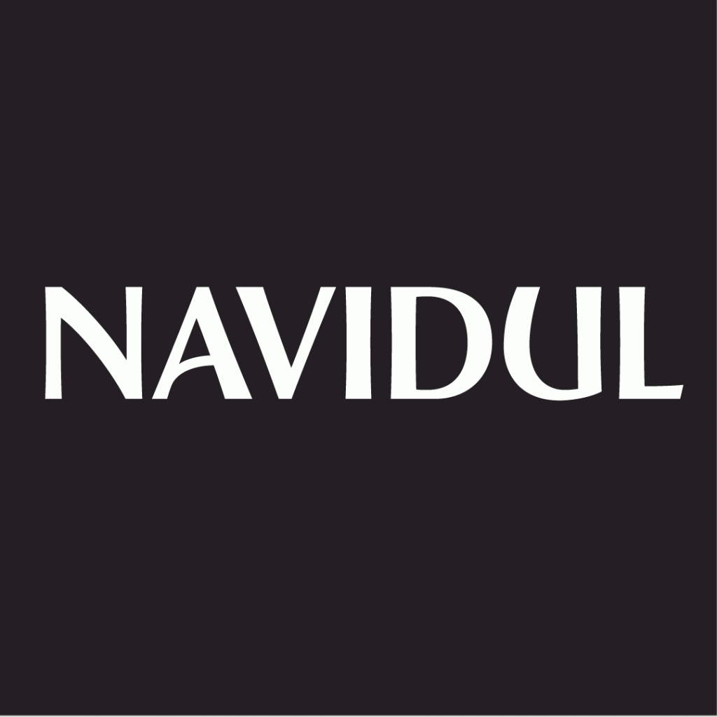
The new packaging concept was applied across a variety of product lines and formats, introducing a distinctive vertical black ribbon that complements the brand identity while serving as a functional label for product information. To further enhance the brand’s uniqueness, a custom Navidul font was developed by a professional typographer, featuring specially designed characters, particularly the letters A, N, and U, to reinforce brand recognition and visual coherence.